Finally, the CSS grid is here. No more tables, no more positioning, and inline-blocks, no more floats or flexbox layout tools. No more hacking and tweaking design user interfaces – we finally have CSS grid layout and this, my darlings, will save us a lot of sleepless nights. This beautiful CSS module is the very first original solution that takes care of the layout problems. Yes, before the CSS grid came out of the closet, we’ve been tweaking our way around for as long as we’ve been making websites. Horrible and disrespectable, right?
So, this article will cover the very basics and of CSS grid concepts, and we can’t wait to get started. In our opinion, the CSS grid is one of the most powerful CSS modules ever introduced. Yay, let’s go!
The very basics of the CSS grid layout
Let’s define a grid
First, let’s define a grid. The CSS Grid Layout Module presents a grid-based layout system – you can probably imagine a grid – a set of horizontal and vertical lines that intersect. These intersecting horizontal and vertical lines are actually defining columns and rows where we can place different elements, and the grid layout makes it easier to design web pages without the use of floats and positioning. Similar to tables, a grid layout enables the positioning of elements into columns and rows.
Browser support
All modern browsers support grid properties.
What are grid elements?
We’ve already mentioned elements in this article – we position elements somewhere on a grid, but what are grid elements?
First, we should know that a grid layout consists of a parent element, and that parent element can have one or more child elements. Whatever applies to a parent element, becomes true for a child element, too. We can position different elements onto a grid – there are many different possibilities of how elements can be aligned onto a grid and they can even overlap each other.
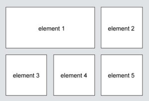
The example below shows an HTML element called “my-grid-container”, which is a parent element in this case, with 6 additional child elements.
<div class="my-grid-container">
  <div class="grid-element-1">element 1</div>
  <div class="grid-element-2">element 2</div>
  <div class="grid-element-3">element 3</div>
  <div class="grid-element-4">element 4</div>
  <div class="grid-element-5">element 5</div>
  <div class="grid-element-6">element 6</div>
</div>
Since we already opened a topic about child-parent relationship (a grid container-parent contains grid items or elements-children) you should read more about a tutorial about CSS grid container properties and their values and a guide to CSS grid items’ properties and their values.
Display property or how an HTML element becomes a grid container
An HTML element becomes a grid container when its display property is set to grid or inline-grid – this way we establish a new grid formatting context for the content of the grid container, and we do it like so:
.my-grid-container {
  display: grid;
}
It is important to bring out that grid generates a block-level grid, while inline-grid initiates an inline-level grid. The difference between block-level grid and inline-grid is that:
- with block-level grid the box is formatted as a block-level box. The majority of formatting conventions valid for other block-level elements are true for block-level grid
- with inline-level grid the box is laid inline.
When in doubt, prefer block-level display types.
Once we display property, either with grid or inline-grid, all children elements of the my-grid-container become grid elements or items.
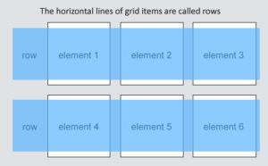
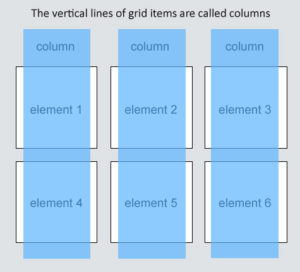
What are grid rows and grid columns?
Grid rows are all horizontal lines of grid elements items.
Grid columns are all vertical lines of grid elements items.
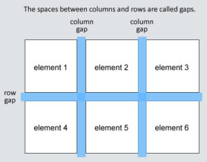
What are grid gaps?
Grid gaps are those spaces between columns or rows.
You can adjust the grid gap by using either grid-column-gap, grid-row-gap, or grid-gap properties. The basic version of defining grid gap for rows goes like this:
.my-grid-container {
  display: grid;
  grid-row-gap: 30px;
}
And a grid gap for column like so:
.my-grid-container {
  display: grid;
  grid-column-gap: 70px;
}
A shorter version where you can define first a row and then a column gap in one line goes like this:
.my-grid-container {
  display: grid;
  grid-gap: 30px 70px;
}
What are grid lines?
Grid lines consist of column lines and row lines. The grid lines are lines between columns and are called column lines, lines between rows are called row lines.
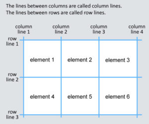
The first top horizontal line is row line 1, and the vertical line positioned most left is column line 1. Since our grid has 6 child elements, we can position our grid to have 3 row lines and 4 vertical lines.
When we want to position a grid element into a grid container, we have to refer to a line number, either column line or row line; depends on how we want our layout to look. Let’s take a look at a few examples.
If we imagine a table with 6 cells, the following example will stretch grid-element-1 through the first and second cell – it will place a grid-element-1 at column line 1, and it will end it on column line 3, like so:
.grid-element-1 {
  grid-column-start: 1;
  grid-column-end: 3;
}
And we can play around the same way with grid-row-start and grid-row-end properties as well:
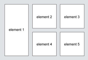
.grid-element-1 {
  grid-row-start: 1;
  grid-row-end: 3;
}
In this case, element 1 will stretch through the first two cells positioned on the left.